[ad_1]
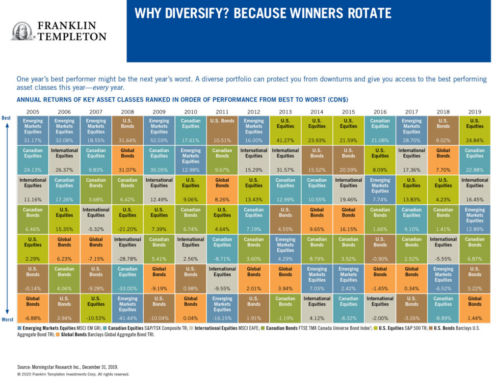
Back in the day, I always enjoyed perusing the annual asset class rotation chart that investment giant Franklin Templeton used to distribute to financial advisors and media. Even though it’s years out of date, I still have the 2015 chart on my office wall.
Curious about the chart’s fate, I asked the company what had become of it and learned it’s still available. But now it’s only available in digital format online.
Reading the Franklin Templeton chart
We have reproduced it for this column and as always I find it enormously instructive. It’s still titled “Why Diversify? Because Winners Rotate.” The top of the chart reads: “One year’s best performer might be the next year’s worst. A diverse portfolio can protect you from downturns and give you access to the best performing asset classes this year—every year.”
Given that 2022 has proven to be a painful year for investors in virtually all asset classes, some may find it helpful to revisit this chart, despite the fact that the latest cycle seemed to top out in November 2021.
Looking at the Annual Returns of Key Asset Classes

The chart lists annual returns in Canadian dollars, based on various indexes.
Right off the top, you see that U.S. equities (the S&P 500 index) are often the single top-producing asset class. It topped the list five of the last nine years—from 2013 to 2015, then again in 2019 and 2021.
On the flip side, bonds tend to be the worst asset class. Over the 15 years between 2007 and 2021, at least one bond class was at the bottom seven of those years. Global bonds (as measured by the Bloomberg Global Aggregate Bond Index) in 2010, 2019 and 2021, U.S. bonds (Bloomberg US. Aggregate Bond Index) in 2019, 2012 and 2017, and Canadian bonds (FTSE Canada Universe Bond index) in 2013.
It is interesting that all those years were considered—in retrospect—a multi-decade bull market for bonds. You can imagine how bonds will look going forward, now that interest rates have clearly bottomed and are slowly marching higher.
The chart runs only till December 2021, but as investors know all too well, even bond funds have been under water in 2022, particularly long-term bond funds and aggregate bond funds that contain many long-term bonds. Longer term bonds are even more susceptible to interest rate increases.
As you might expect, volatile asset classes like emerging markets (EM, which is measured by the MSCI Emerging Markets index) tend to generate both outsized gains and outsized losses. EM topped the chart in five of the last 15 years (2007, 2009, 2012, 2017 and 2020) but were also at the bottom in 2008 and 2011. EM’s largest gain in that period was 52% in 2009, immediately following the 41% loss in 2008. Therein lies a tale!
Looking at the Standard Deviation of Key Asset Classes

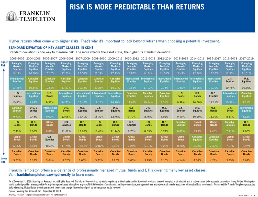
The latest Franklin Templeton online charts also include a second version titled “Risk is more predictable than returns.”
This chart notes: “Higher returns often come with higher risks. That’s why it’s important to look beyond returns when choosing a potential investment.” And it ranks the asset classes from lower risk to higher risk and here the results are remarkably consistent across almost the entire 15-year time span between 2005 and 2021.
The lowest risk in every one of the time periods covered is Canadian bonds, typically with returns of between 3% and 4% (a 4.77% high from 2019 to 2021). And consistently the riskiest is EM equities, which were listed as the riskiest single asset class from 2005 to 2019, replaced only by Canadian equities between 2018 and 2021.
Almost as consistently, the second lowest risk asset class were global bonds, while the second riskiest were International equities (MSCI EAFE index from 2010 to 2017) and Canadian equities (from 2005 to 2011.)
Looking outside of the chart
This is all valuable information, but, alas, these charts seem to focus almost exclusively on the big two asset classes of stocks and bonds, precisely the two that are the focus of all those popular all-in-one asset allocation exchange-traded funds (ETFs) pioneered by Vanguard and soon matched by BMO, iShares, Horizons and a few others in Canada.
Even these seemingly prudent broad-based diversified investments will likely show disappointing results once these charts are updated for 2022. When a classic 60/40 balanced fund, like Vanguard’s VBAL is down 13% through October 31 (I know, because I own it), you know we’re in tough times, even for conservative investors.
For me, the disappointment is that the “Why diversify” chart—like most of the asset allocation (AA) ETFs, for some reason—ignores alternative asset classes like gold or precious metals, real estate or real estate investment trusts (REITs), commodities, inflation-linked bonds and cryptocurrencies.
Refer to my earlier column this year on Ray Dalio’s All-Weather portfolio, which holds many of these. Interestingly, I see that Fidelity added 2% or 3% crypto exposure to its new asset allocation ETFs, depending on how aggressive of a mix you pick.
The ETF panelists for the 2022 edition of the MoneySense’s Best ETFs in Canada wisely passed on awarding the Fidelity AA ETFs an all-star status this year, a decision that was soon vindicated by the June crash in crypto, where even bitcoin plunged below USD$20,000 and lately has been languishing below USD$16,000 ever since.
So much for the claim that cryptos are an inflation hedge. It may be better to go with more proven inflation hedges, like precious metals. Gold is trading slightly lower from where it started the year, but at least it hasn’t fallen like most other asset classes in 2022. Again, the Franklin Templeton chart doesn’t show pure bullion or real estate, or more esoteric asset classes like farmland, art or wine. However, while gold stocks and REITs are included in the more general equity categories, it would be interesting to see some of these alternatives with their own category.
Jonathan Chevreau is the Investing Editor at Large for MoneySense. He is also founder of the Financial Independence Hub, author of Findependence Day and co-author of Victory Lap Retirement. He can be reached at jonathan@findependenceHub.com.
Read more Retired Money:
- The 60/40 portfolio: A phoenix or a dud for retirees?
- How might inflation impact your retirement plans?
- Tontines in Canada: Moving from theory to practice as a solution to our retirement crisis
- Delaying CPP and OAS to age 70: Is it worth the wait?
The post Reading the “Annual Returns of Key Asset Classes”—what it means for Canadian investors appeared first on MoneySense.
[ad_2]
Source link

